 |
OK and Cancel Buttons
What's the Right Order?
by Tom Tullis
Originally posted February 28, 2008; Last modified March 29, 2008
|
Introduction
There's some debate among web designers, usability people, and other
geeks who think about these kinds of things, about the correct order for
"OK" and "Cancel" (or similar) buttons in a web application. There are
several precedents that people point to:
- In the Windows environment, the standard has for many years
stated that when the buttons are placed at the bottom of a modal window,
they should be grouped together with "OK" on the left and "Cancel" on
the right. See, for example, the Windows
Vista User Experience Guidelines. The Sun Microsystems Java
Look and Feel Design Guidelines also specifies
this order. The logic behind this appears to be based on the
left-to-right reading order in Western cultures, which causes "OK"
(presumably the more important or commonly used button) to be read
first.
- In the Macintosh environment, the standard has been the
opposite: buttons at the bottom of a modal window should be grouped
together with "Cancel" on the left and "OK" on the right. See, for
example, the Apple
Human Interface Guidelines. The logic behind this appears to be
based on reading a book, where the button on the right (OK) is
associated with moving forward, like turning a page in a book.
- In the web environment, there's no clear standard. The closest
is perhaps the use of "Previous" and "Next" buttons in a sequence of
related pages, where the de-facto standard is that "Previous" is on the
left and "Next" is on the right, except on the last page where it is
replaced by "Submit" or "Done".
So what's a web designer who has a need for "OK" and "Cancel" functions
to do? First, let's clarify what is meant by these functions:
- OK function: This causes a pending action to be executed, such
as saving some changes or submitting an order. Common labels on the web
are "OK", "Save", "Submit", and "Done".
- Cancel function: This causes a pending action to be cancelled,
and the user is returned to the state prior to the initiation of the
action. The most common label on the web is probably "Cancel". ("Back"
is sometimes used, but is easily confused with the Back function of the
browser.) "Close" is a related function, but does not carry a
connotation of discarding a pending action.
After some questions about the most appropriate order for these buttons
on a web application came up on a usability-related email distribution
list, I decided to conduct an online survey of usability and user
experience professionals to see what order they think is best.
The Survey
The survey was built using SurveyMonkey.
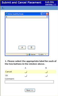
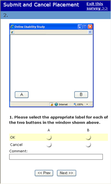
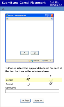
There were four questions, as illustrated here:

(Click on a page image to see a full-size version.)
There were two variables represented by the four questions and their
associated images:
- Button placement: Either grouped together (pages 1
and 3) or separated (pages 2
and 4).
- Button labels: Either OK and Cancel (pages 1
and 2) or Submit and Cancel (pages 3
and 4).
The order of listing of the labels (OK and Cancel, Submit and Cancel) was
randomized to avoid biasing the respondents. As illustrated in page 3
above, the user was allowed to check only one response in each row and in
each column.
A link to the survey was sent to the usability email distribution list
and to an email list of web designers and user experience professionals in
my company.
Results
The survey was live for about 24 hours, on parts of February 26 and 27,
2008. A total of 64 people responded. The results for each of the four
questions were as follows:
|
| |
A
|
B
|
| OK |
51%
|
49%
|
| Cancel |
50%
|
50%
|
|
Comments:
- These are too close together.
- But OK should be default
- Other than when info is 'left-concentrated'
- I'm just stuck on the windows standard.
- Intended, or positive action first
- Ok maps to moving forward, Cancel maps to
Back...
- windows convention
- I'd prefer 'Back' to 'Cancel'. 'Cancel' seems
too final
- standard Windows practice for popups
- Using "verso/recto" paradigm, B moves user to
the next page.
- I guess you could relate it to back and forward
- back being to the left and forward to the right
- i want the "submit" or whatever it's called
that's taking me "forward" to be the furthest to the right.
(like turning to the next page.)
- In most of western civilization, we read
right-to-left, top-to-bottom. Lower right should move forward
positively.
- Cancel is a label too often used in contexts
where it ought not.
- Our standard is progressive action on right.
- it is a mac vs pc question. if i was on a mac i
would have answered the other way
- For right-handed users, OK on the right is
often closer.
- the right side is turning the page, moving
forward, in our culture.
- I beleive that cancel should be a link
- Not just the comic strip, but everything on the
Windows platform is OK/Cancel. OK on the left, Cancel on the
right.
- Meshes with standards set for Windows apps
earlier on
|
|
| |
A
|
B
|
| OK |
24%
|
76%
|
| Cancel |
76%
|
24%
|
|
Comments:
- If you have to have a cancel button, that's
where to put it.
- But I would not put them so far apart unless
they were paired with other buttons in some way.
- Could go either way
- The visual seperation is what does it for me
here.
- Ok=forward, Cancel = go back
- Used to seeing them in this order
- Again, 'Back' is preferred to 'Cancel'
- because they're pushed toward the edges, they
look more like navigation, thus right means continue, left
means go back
- I would never split the buttons this way.
- I would expect this sort of separation to
indicate something more like Prev, Next.
- this makes no sense. "b" should be "next" no
clue what "A" should be
- Better than previous - separation will reduce
mistakes
- You can move them around, but they're still the
same! This is not Previous/Next, it's OK/Cancel.
- This is tricky. I assume this is within context
of a wizard. In this case, i might advocate for A = Return to
Previous Screen, and B = Next Step (to Step 2 of 6) etc.
|
|
| |
A
|
B
|
| Submit |
42%
|
58%
|
| Cancel |
58%
|
42%
|
|
Comments:
- Z-pattern scanning
- Except when info is left-column-focused
- This is a tough call, because there is an
argument that the positive should be presented first but then
you are inconsistent with the cancel
- I don't like 'Cancel'!
- How about Submit/Resist? [Smart
alec!]
- Submit=OK, so I'm not changing my answer.
- Same principle as Ok/Cancel
|
|
| |
A
|
B
|
| Submit |
24%
|
76%
|
| Cancel |
76%
|
24%
|
|
Comments:
- Either
- Same, similar comments as before.
- again - this makes no sense. next and previous
make sense with this set up
- Same comment as #2. I'd only assume this design
would only be used within a stepped process. Otherwise, it's
just confusing.
|
Discussion
The most surprising result to me was for Question 1.
With the buttons grouped together, and the "OK/Cancel" labels, respondents
were evenly split in terms of which button should be "OK" and
which should be "Cancel". Clearly there's not a consensus of any sort in
the usability community about which way to go in this case.
The two designs that had the buttons separated (Questions 2
and 4) yielded the most consistent results.
In both cases, the action to continue ("OK" or "Submit") was put by 76% of
the respondents on the right, with the "Cancel" action on the left.
The design that had the buttons grouped together, and used the
"Submit/Cancel" labels (Question 3) was
in-between: 58% put "Submit" on the right and "Cancel" on the left, but
42% did the opposite. The difference from chance (50/50) only just reaches
significance (Chi square, p=0.05).
Takeaways
My main takeaways from this survey are as follows:
- Avoid using grouped buttons labelled as "OK" and "Cancel" on the web
(as in Question 1). There's too great a
chance that your users may have a different expectation from yours about
which button is which. If they're in a hurry, they might accidentally
choose the wrong button.
- It's probably better to use buttons that are visually separated
(although perhaps not to the extreme as the ones in this survey).
- With the buttons visually separated, putting the action to continue
(e.g., OK, Save, Submit, etc) on the right is more likely to match your
users' expectations.
There's an interesting article on a related topic by Luke Wroblewski
about Primary
and Secondary Actions in Web Forms which includes eye-tracking data.
Comments? Contact Tom@MeasuringUX.com.
Measuring UX Homepage